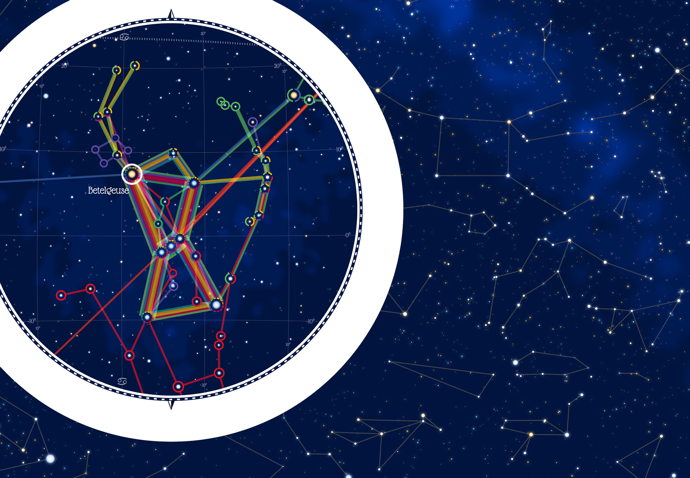
A Brand-New Website and Visualizing Constellations Across Cultures
Sharing my latest personal & client projects, art collections, blogs, and more
It took a few months, but I made a brand-new website! This time it’s all “homegrown” (using hugo), so I could make it exactly as I wanted (well, as far as my hugo/HTML/CSS skills let me). I also created a giant interactive story about how people from different cultures across time and space have seen figures in the night sky. Plus, a big data art piece for a Dutch airline.
Figures in the Stars | Personal Project
An interactive visual story that looks into how current & past cultures across the World have seen their myths in the stars. Focusing on several of the brightest and most famous stars & constellations. Are there certain "shapes" that cultures everywhere have recognized? Hopefully, you'll also be able to recognize a few new constellations after reading this!
This is the final data sketches month that I still had to finish! With the topic of Myths & Legends, it took me a long time to figure out the exact angle I wanted to investigate. But once I finally thought of constellations, I knew it was the perfect final theme. Combining my background & interest in Astronomy and my passion for data visualization
See the Article
A Year in Flights | Transavia
A data art piece created for Transavia, a Dutch airline, that conveys the intricacies of a year’s worth of their flights. Each flight is turned into an abstract shape whose appearance is completely determined by its data.
See the Project
New Website! | Visual Cinnamon
After 2 months of work, I was exceptionally happy to reveal my new site. Created from the ground up, this gives me much more freedom in the design & options for adding interactive dataviz. I hope you'll like it!
See the New Site!
Upcoming excitement!
I haven’t posted about as many new projects as I would’ve liked (partly due to several internal client projects). However! Another reason is that I’ve been working on two rather big projects. A small teaser I can give is that one project is for UNESCO, where we’ve dubbed the resulting visual “The Constellation” and where we’re adding several more options & layers before it’s revealed in December.
And finally, at the end of June, I went to New York to record a ±1-2 hour data visualization course with Skillshare that is scheduled to come out in the next couple of months. Super excited about this, and I hope to be able to share more soon!


