

A Giant DataViz Project about how We Try to Better Understand our Pets
Sharing my latest personal & client projects, art collections, blogs, and more

From exploring how people search for their cats & dogs with Google, to a new blog about the challenges of doing dataviz on mobile vs desktop, revealing the difference between "clock" and solar noon for the Scientific American, and more.

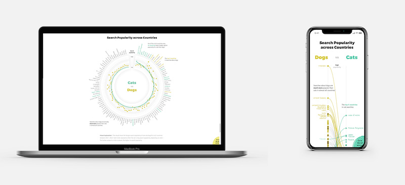
Why do cats and dogs ...? | Google News Lab
I've had the pleasure of working with Simon Rogers and Alberto Cairo from Google again to create an extensive dataviz-driven story. The topic this time? Our pets! What do people most search for to understand cats and dogs better?
You can explore the most popular questions asked on Google that start with “Why do cats / why does my cat / why are cats” and some more variations, plus the same for dogs. What “strange” behavior is asked so often that it appears actually to be quite normal. What’s up with cats and cucumbers, while dogs apparently have a fascination with eating poop?! The story takes you through the most interesting and funny insights found in the data through several whimsical and interactive visuals.
Check out the Project!
In case you’re interested, I also wrote a humongous blog about the design process that went into creating “Why do cats and dogs ...?”, the biggest project I've ever worked on.
Read the Full Blog

Shareholder Report | Adyen
Adyen, a payment service provider, wanted to feature more than just text and tables in their second-ever shareholder letter & annual report. Looking at what data might be interesting to visualize, I eventually turned several tables from the reports into 4 more extensive visuals about the income statement, costs, regional and FTE growth.
See the Final Visuals
Blog | Dataviz on Mobile vs. Desktop
I've recently written an extensive blog about Techniques for Data Visualization on both Mobile & Desktop. From doing nothing all the way to creating a different chart for mobile and desktop. I'm sharing and explaining these and many more examples in the blog. Hopefully, they can act as an inspiration for how you might tackle your own dataset and visual.
Read the Blog
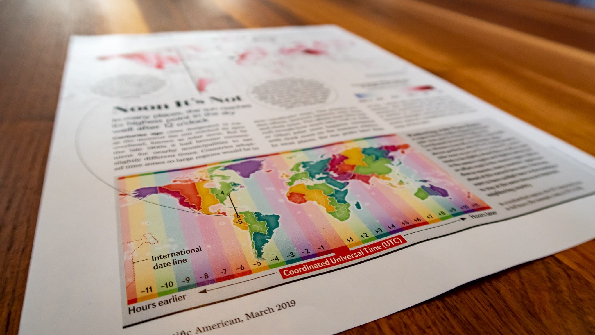
Noon it’s Not | Scientific American
For the March 2019 issue of Scientific American, I created the Graphic Science page. From pitching the initial idea to the data gathering, preparation, visualization, and writing the text (ofc with the great assistance of the SciAm team!). The article shows that the Sun is not at its highest point when our clock strikes noon in many locations around the world, with the difference reaching up to 3+ hours in Western Alaska and China on the longest day of the year, June 21st.
See the Graphic Science Page
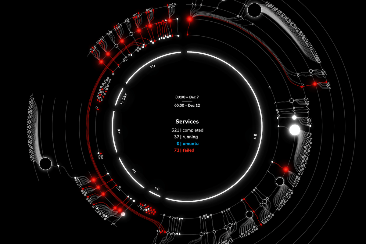
Visualizing task dependencies | alis
My client, alis_, was looking for a way to visualize the services running on their custom operating system; to reveal if the OS was running well and which tasks were failing, but also to show the dependencies of services having created new services. The final visual is meant for both management and marketing purposes and thus had to be effective, still look good, and be on brand. After an extensive design phase to investigate what forms revealed the insights, I developed a custom interactive visual called a “depth circle” as a fully working prototype, which they incorporated into their systems.
See the Interactive Visual

Dataviz Course | Skillshare
Together with Skillshare, I've created a 1-hour course in which I share my tips and best practices on taking data visualization beyond the default. You can take my Customizing Charts for Beauty & Impact course for free through the link below with a 2-month Skillshare trial!