Aliens, Two Big Posters, and an Interactive DataViz
Sharing my latest personal & client projects, art collections, blogs, and more
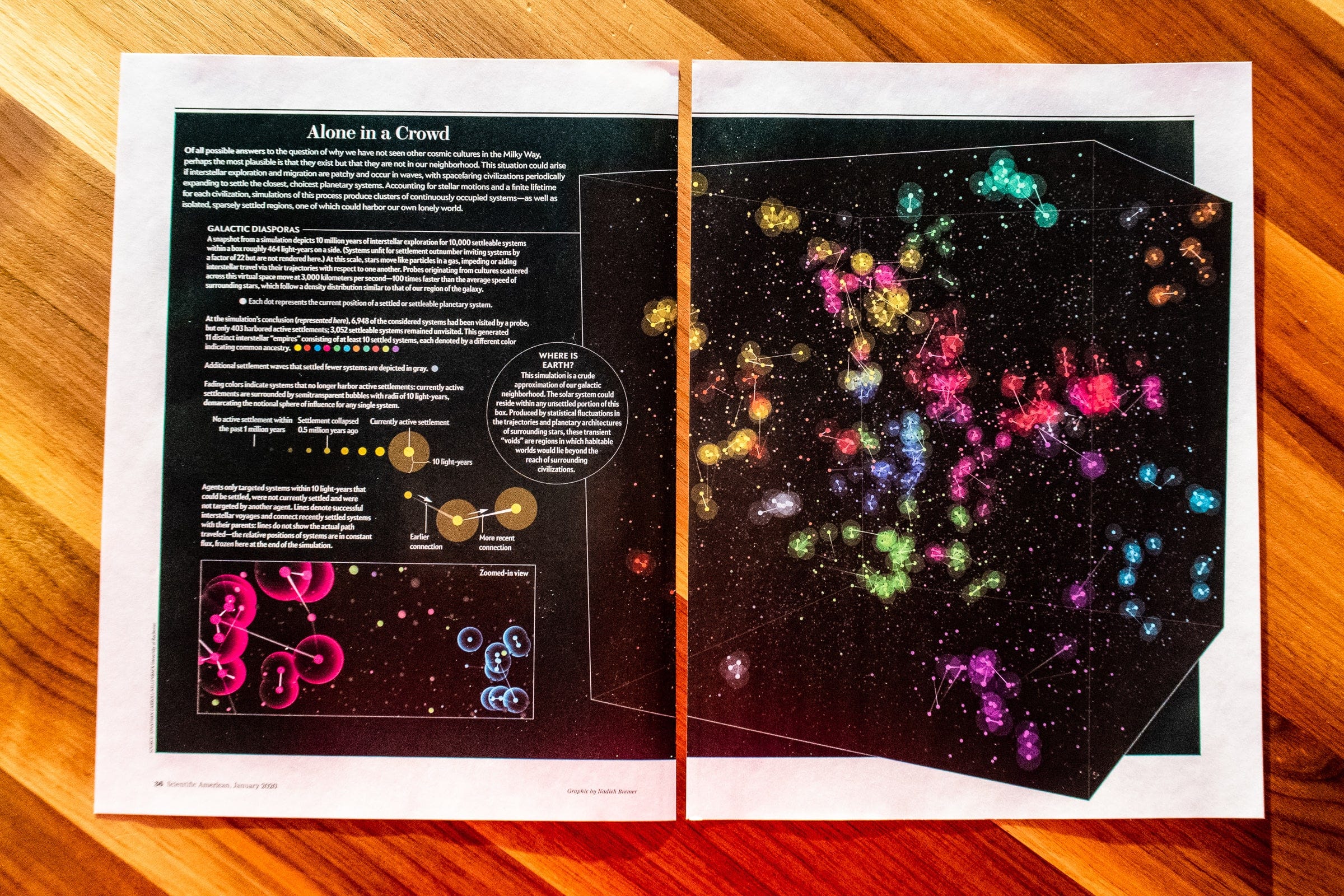
A lot of print and poster work this time! From a full spread about star-hopping alien civilizations for the Scientific American. But also the attitudes of US consumers, ingredient used across the world, polling results for the democratic candidates, and a new interview in which I share how I work in terms of tech and approach.
Alone in a Crowded Milky Way | Scientific American
For the January edition of Scientific American, I created the visual for the excellent article “Alone in a Crowded Milky Way.” Ever heard of the Fermi Paradox? The apparent contradiction between the lack of evidence of alien civilizations and the generally high estimates for their probability to exist. Researchers have been tackling this concept for decades, and this article goes into the findings of one of the latest simulations. Really, the article is an awesome (and accessible) read. I highly recommend it!
Read the Scientific American Article
Attitudinal Dimensions of American Consumers | Kantar
I created two very different data visualizations for Kantar Consulting using their MotiveMix dataset. One is a large poster (in two color options; black and white) meant for their new office and an animation to be viewed online. MotiveMix looks at American consumers along 12 "attitudinal dimensions" such as Tech Disposition, Environmentalism, Cultural Connection, and more to better understand what is important to consumers in the counties across the US. I really love creating static visuals and posters since I know 100% sure how the final image is going to look on every screen and browser ^.~
See More Images and Close-Ups
Exploring a Product Portfolio | Janssen
Another poster! Created in 2017, and finally able to share it. This giant, meant-to-be-A0 poster provides an overview of the ingredients within the Janssen product portfolio and the extent to which those ingredients are observed across a network of healthcare data that is available throughout the Johnson & Johnson enterprise. Revealing insights such as seasonality in use and parts of the world where a certain ingredient is used more often.
See More Images
Preferential Polling Results | Swayable
I was finally able to work with Voronoi Treemaps! I've wanted to create one for years, but it was first technically impossible for me, and then came along with the amazing d3-voronoi-map plugin! I'm glad my client, Swayable, agreed it would work well with their dataset about how people would vote for the upcoming US presidential elections. This isn’t just about a person’s “top choice,” but instead asks to rank all the candidates. It’s called instant-runoff voting (and has many other names too). The interactive visual shows how the results evolve as Swayable does new surveys, and you can see it in action on their blog.
See More Images and the Other Visuals
Learn my personal tips for better DataViz
Also made resolutions to do and learn new things in this new decade? Is getting better at data visualization one of those perhaps? In that case, hopefully, I can help! Together with Skillshare, I've created a 1-hour course in which I share my personal tips and best practices on taking data visualization beyond the default. You can take my Customizing Charts for Beauty & Impact course for free through the link below with a 2-month Skillshare trial!
Check Out the Course on Skillshare!
Interview | net magazine
I’m very happy to be featured in the current (Feb 2020) issue of net magazine! They asked me very pointed questions and wanted to know the craziest other small bits, from my important dates to favorite artists, things that make my life worthwhile. I even divulged the thing that I'm currently crazy about (personally) but haven’t yet shared online... I don't have the issue yet myself to provide a photo, but I believe I’m on page 48 for those that do have the magazine ^_^


