Opening an Online Shop for High-Quality DataViz Prints & Pen Plots!
Sharing my latest personal & client projects, art collections, blogs, and more
Lots of new things to share! The biggest update is that I've opened up an online shop! In which I'm selling not only high-quality prints of several of my favorite data visualizations and data art but also limited edition pen plots that I've been obsessing about since April. But there's much more, such as my projects for Greenpeace Unearthed & Public Eye looking into harmful pesticides, visualizing alien systems for Scientific American, and a podcast interview for Being Freelance!
Brand new online shop!!!
Finally! I've finally gotten around to setting up an online shop! I've been wanting to expand my work into the real world for a long time. To create high-quality prints of some of my favorite data visualizations and be able to sell these in my own shop.
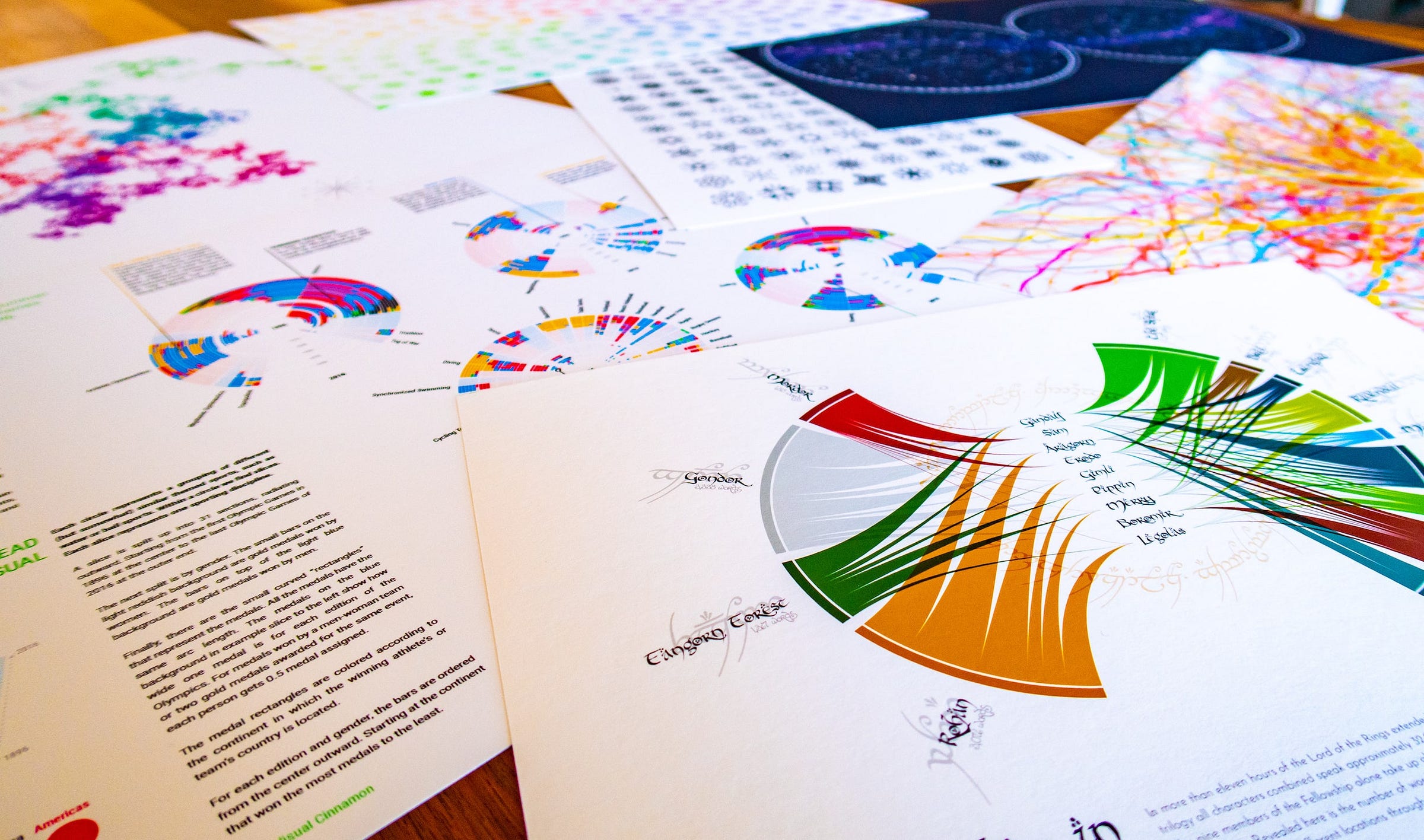
Behind the scenes, I've been making A3 / A4 print versions of Marble Butterflies, Hubble's 30-year legacy, The Words in the Lord of the Rings, Star maps, and more. Right now, you can choose from 19 different prints, some of which are limited editions. These are printed on-demand, with archival-quality ink and paper (which is gorgeous, I've had test prints of each poster series sent to myself).
I hope you'll like the current collection. And if there's a project of mine not yet up there that you'd be interested in seeing as a print, let me know (via email or on Twitter)! (ノ◕ヮ◕)ノ*:・゚✧
Check out the Shop!
Stepping into the world of Pen Plotting
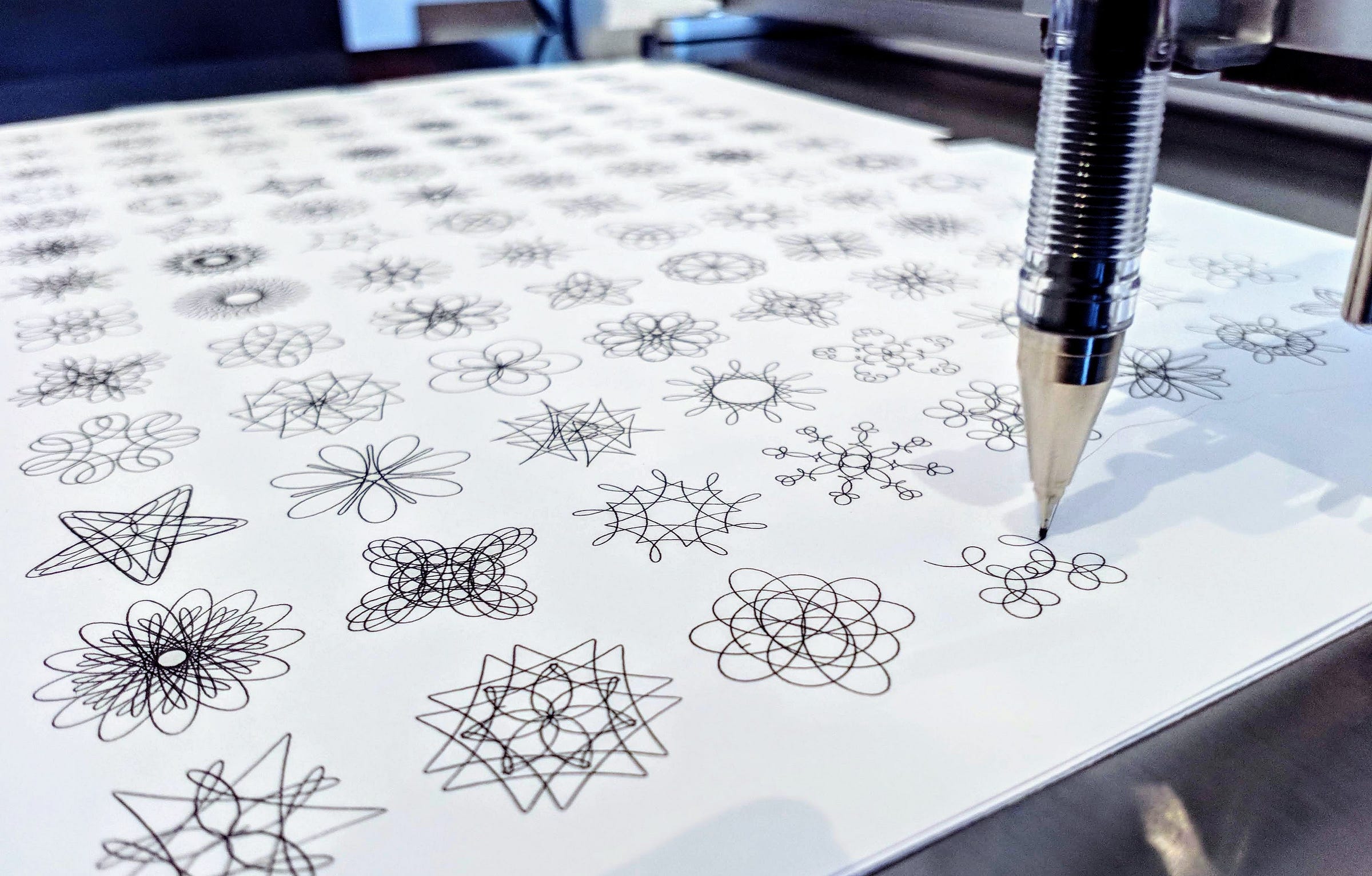
If you've been following my Twitter or Instagram accounts, you may have noticed that I've been working on something else besides data visualizations since the start of April; pen plotting! I finally bought an AxiDraw V3/A3, and I've been having tons of fun ever since. I'm still in my spirograph/harmonograph/guilloche phase, but I'll just let my curiosity guide me on what to work on next.
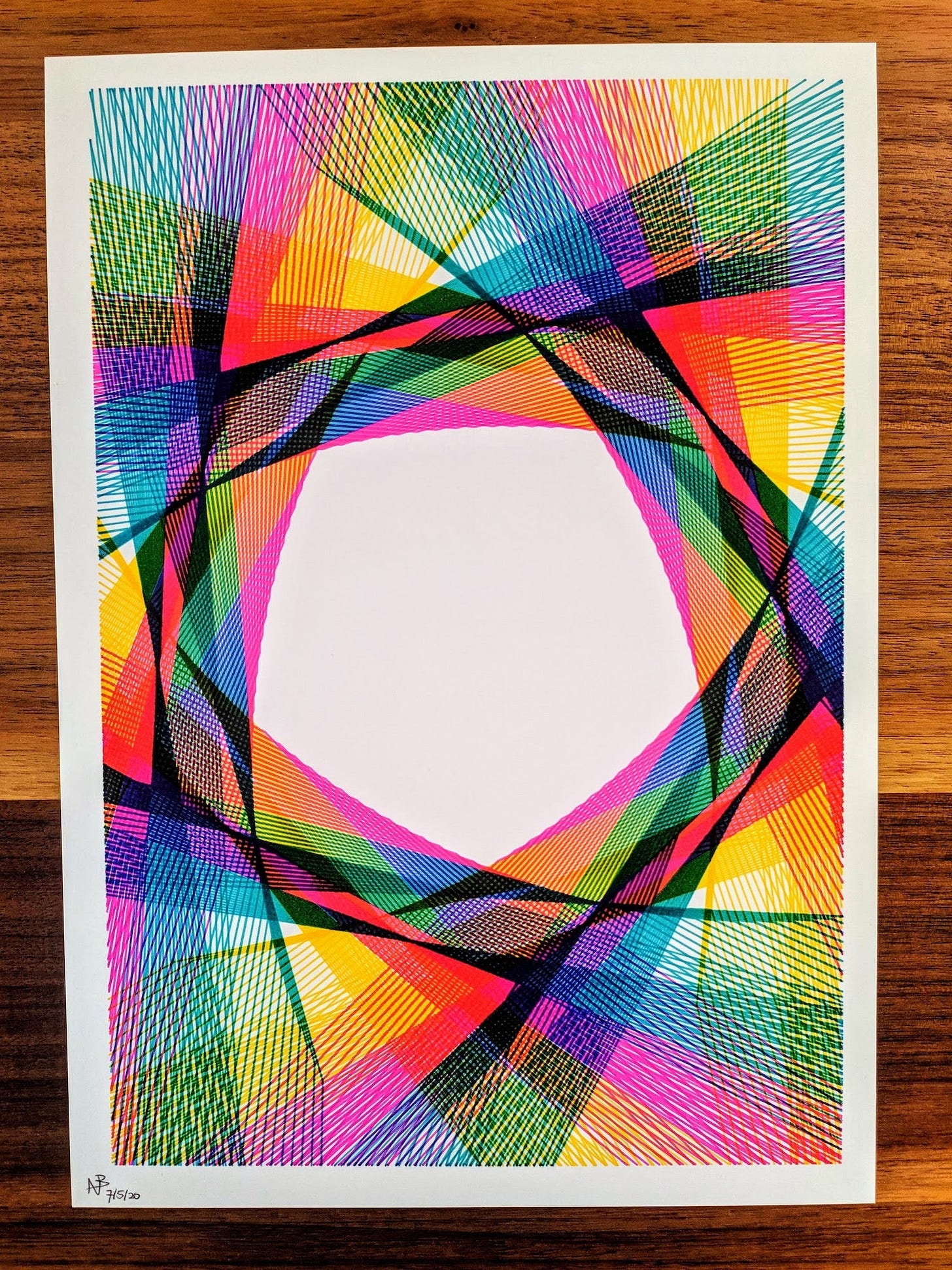
I've been getting such lovely reactions to the shared results that I've put several of the plots in my online store. These are all limited editions (each out of 10) because I want to keep things diverse for me as well, seeing as I'll be sitting next to the machine that generally takes 1-2 hours to draw out each plot ^.~
Hubble's 30-year Legacy | Physics Today
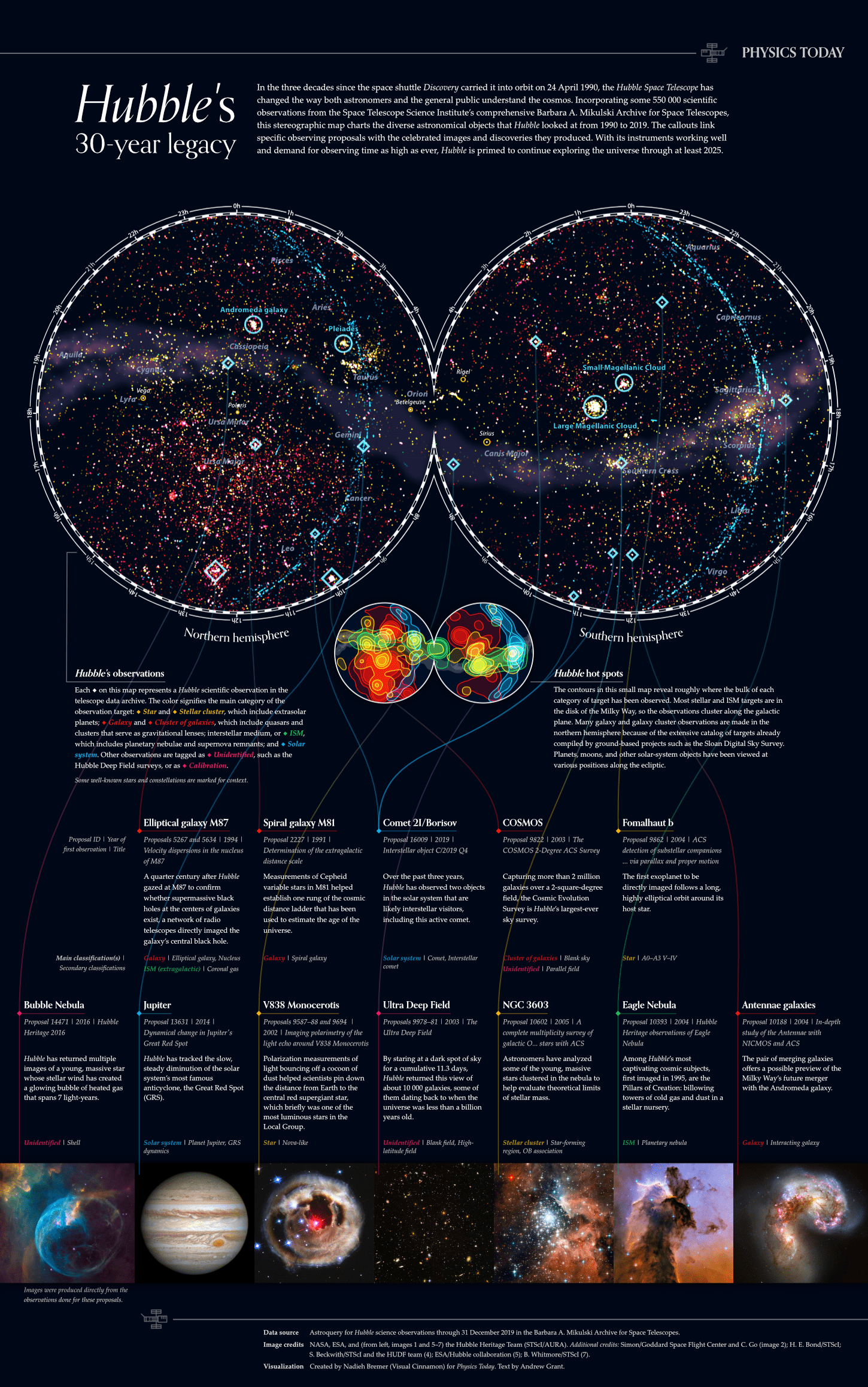
One of my proudest data visualizations ever! In celebration of the Hubble Space Telescope’s 30-year anniversary in April 2020, I created two static visualizations for Physics Today to be used in their series of articles on Hubble’s history. The main visual became a full poster that revealed over 550,000 observations on a sky map while highlighting some of the most famous observations and photos.
See the First Article
The second visual was created as a companion piece outlining the different target classifications of Hubble’s observations. From supernovae to gravitational lensing, interacting galaxies, and exoplanets, outer space is full of the most amazing objects, and Hubble has watched some of the most amazing ones!
See the Second Article
Highly Hazardous Pesticides | Unearthed
Unearthed, the journalistic arm of Greenpeace, has done a large-scale investigation together with Public Eye, an NGO from Switzerland, on the sales of hazardous pesticides by the CropLife companies. I created several eye-catching visuals to accompany the different articles that each team has written about the findings from the investigation.
See All the Visuals
Alone in a Crowded Milky Way | Scientific American
For Scientific American, I created a visual for the excellent article “Alone in a Crowded Milky Way.” Ever heard of the Fermi Paradox? The apparent contradiction between the lack of evidence of alien civilizations and the generally high estimates for their probability to exist. Well, researchers have been tackling this concept for decades, and the original article goes into the findings of one of the latest simulations.
The visual was created as a static piece for the printed magazine. However, because I create all my visuals through code, it wasn't a far stretch to also make a video that "flies through" the cube of (alien) systems, giving you a new perspective on the simulation. Plus I also added several more up-close shots. You can see the new content on my portfolio page on the project.
See More from the Full Article
Learn my Personal Tips for Better DataViz
Just a small reminder that in these times when we all need to learn digitally, together with Skillshare I've created a 1-hour course in which I share my personal tips and best practices on taking a data visualization beyond the default. You can take my Customizing Charts for Beauty & Impact course for free through the link below with a 2-month Skillshare trial!
Check out the Course on Skillshare
Podcast | Being Freelance
I had a really great time talking to Steve Folland from the Being Freelance podcast! He asked some really in-depth questions about how I got into, and go about freelancing. Plus, I got to share two rather odd facts about myself in the final "2-truths-1-lie" section near the end. I hope you'll enjoy listening to it!


