

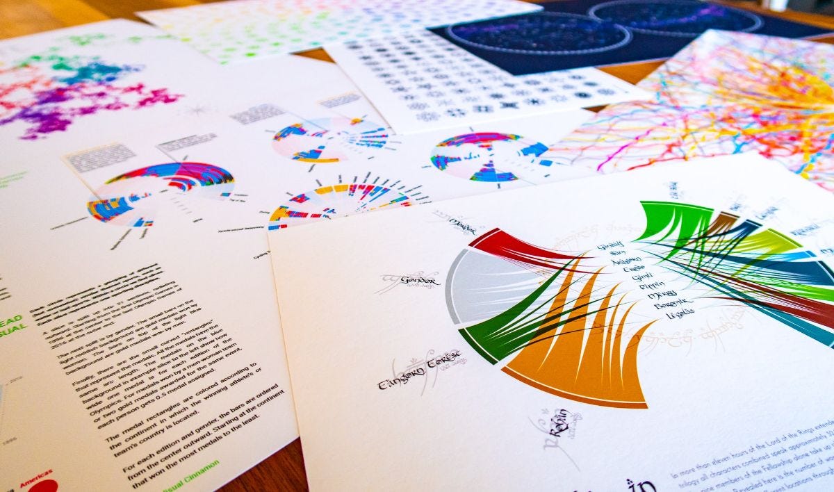
A Data Art System for Sony Music & several Astronomy DataViz Projects
Sharing my latest personal & client projects, art collections, blogs, and more

Data Art for Sony Music | Design blogs galore | Free shipping in my store | Satellites for Scientific American | Interview with Andy Kirk

A Data Art System | Sony Music Entertainment
I was extremely excited when Sony Music reached out to me with the idea to use data to design modern record certification plaques, those "Gold" and "Platinum" records that celebrate milestones in the journey of a song or an album.
Using inspiration from the typical look of a gold record, I created a data art system for Sony Music that creates a unique (40x50cm) poster with the data from a song; using data from Spotify's streams, charts, playlists, audio & feature analyses, Youtube streams and even data taken from the song itself.
You can already find (giant, printable) posters for 6 songs in the release blog that Sony Music wrote for it. They were also kind enough to include the creation of a design process blog post in the project in which I wrote a very detailed account of how I ended up with the final poster system.
Check out the Design Blog
Shop | Free Shipping on Everything!
Now that my online shop has been open for ~4 months (a virtual hug to everyone who's bought a print and/or pen plot!) I've learned more about how things work behind the scenes. A bonus for you is that I'm now offering free shipping on everything! This includes a track trace for the data visualization prints. For the pen plots, that includes standard shipping, and you can upgrade to a tracking code for a small amount (^▽^)
Since May, I added 5 new prints for the "Figures in the Sky" series and a new pen plot inspired by Lissajous curves.
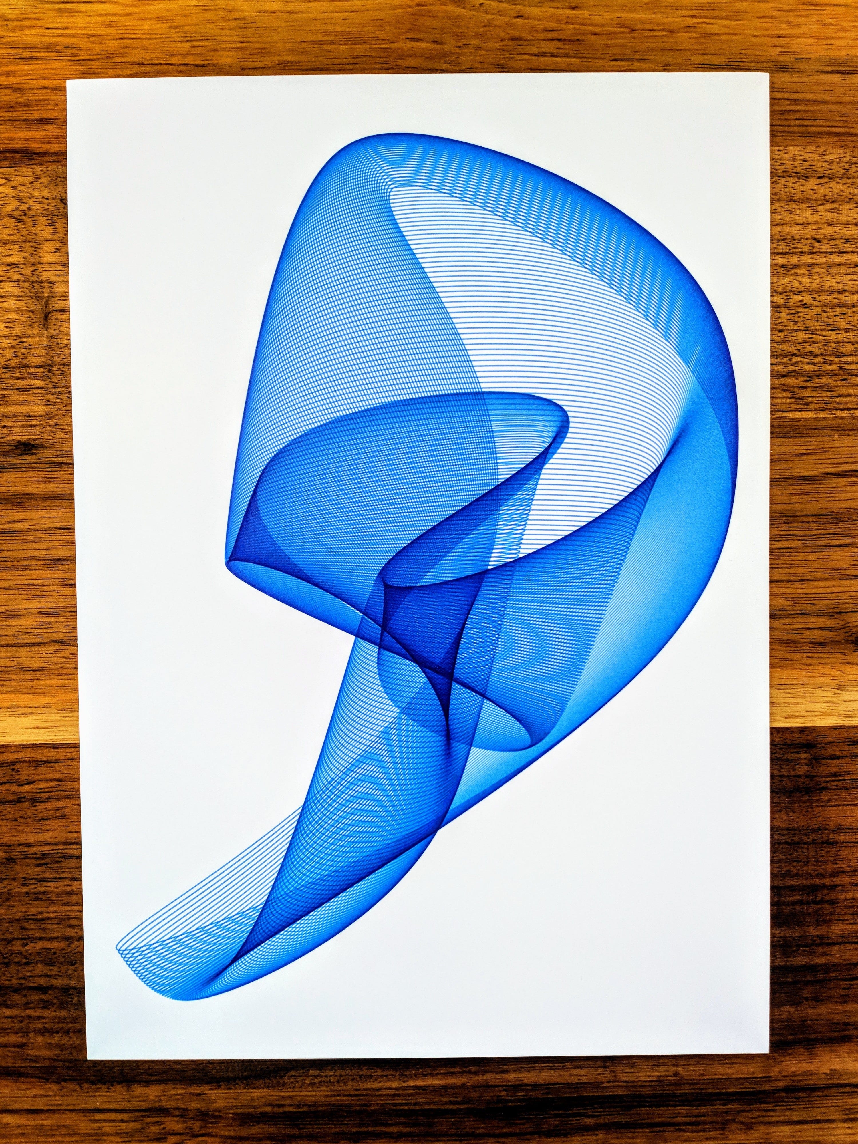
PS | Only 2 more left of the blue Harmonograph #17176 pen plot from the image above before it's sold out!
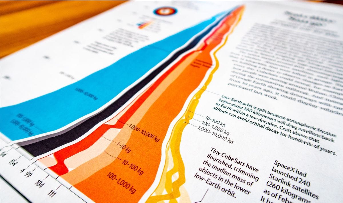
Satellite Surge | Scientific American
For the May issue of Scientific American, I created a visualization showing the rise and recent surge in the number of satellites that orbit Earth. The request was to make a visual that wouldn’t be a more typical “visual that shows the satellites as dots around the Earth” and should instead be something more visually bold. I ended up creating a "home-cooked" hybrid between a streamgraph and bump chart to reveal the enormous rise in tiny satellites over the past few years.
See More About the Visual
PS | I recently finished another satellite-related visual for an upcoming issue of Scientific American (full spread this time!) that I'll share in my next newsletter. I just can't get enough of working on these space-related visuals!

Blogs | Creation of the Hubble Visuals
The Sony Music blog isn't the only design process blog I've written recently. In the last newsletter, I shared the data visualizations I made for Physics Today to celebrate the Hubble Space Telescope's 30th birthday.
You can read a very detail-oriented blog about creating and designing the main poster with all of Hubble's ±500,000 scientific observations. And another shorter design blog about the visual that explores the main targets that Hubble has observed.

Interview | Explore Explain
Andy Kirk interviewed me for his new Explore Explain series, where we talked in-depth about the entire process of creating the alis visualization. From working with the client, considering brand guidelines, the very roundabout design process, implementing interactivity, and more.