Custom (Personal Data) Maps & Exoplanet Art
Sharing my latest personal & client projects, art collections, blogs, and more
Hi again!
It’s “only” been about six months, at least not another year as before.
I don’t often get to work on maps, but a trip to Norway made me dive into OpenStreetMap and how to make a custom map (using JavaScript). And there are even two(!) new astronomy projects; the first is a data art piece about exoplanets, and the second is a visual for Scientific American about our nearest stars ・゚✧
+ some sneak peeks at what I’m working on now!
Mapping (my data in) Norway | Personal
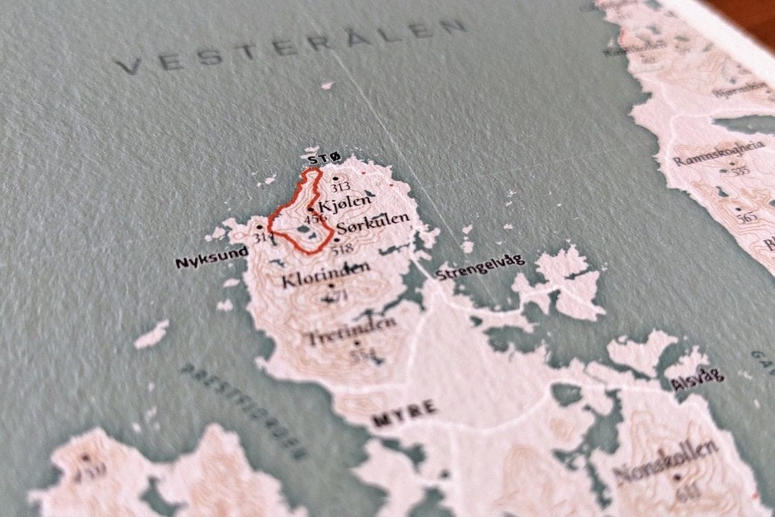
Last year I traveled through Norway for 5 months, working on the bad days, and hiking on the good ones. Starting in the South and slowly moving North as summer came around. To commemorate this trip, I created a map of my favorite part of the whole trip. I loved all of Norway, but Senja, Lofoten & Vesterålen really stole my heart.
Using R, the OpenStreetMap API, and more open data sources and tools, I created this map layer by (geoJson) layer. I’m also an avid “activity tracker” with my smartwatch and added all of our hikes to the map in red. This made me realize that there is even more personal/quantified self data that I could add, such as the Google Location History, the ferry crossings, and the locations we stayed overnight. And so this map became a really personal piece that I had printed and is now hanging in our hallway.
Check out the Map!
The Essence of Us | Data Art
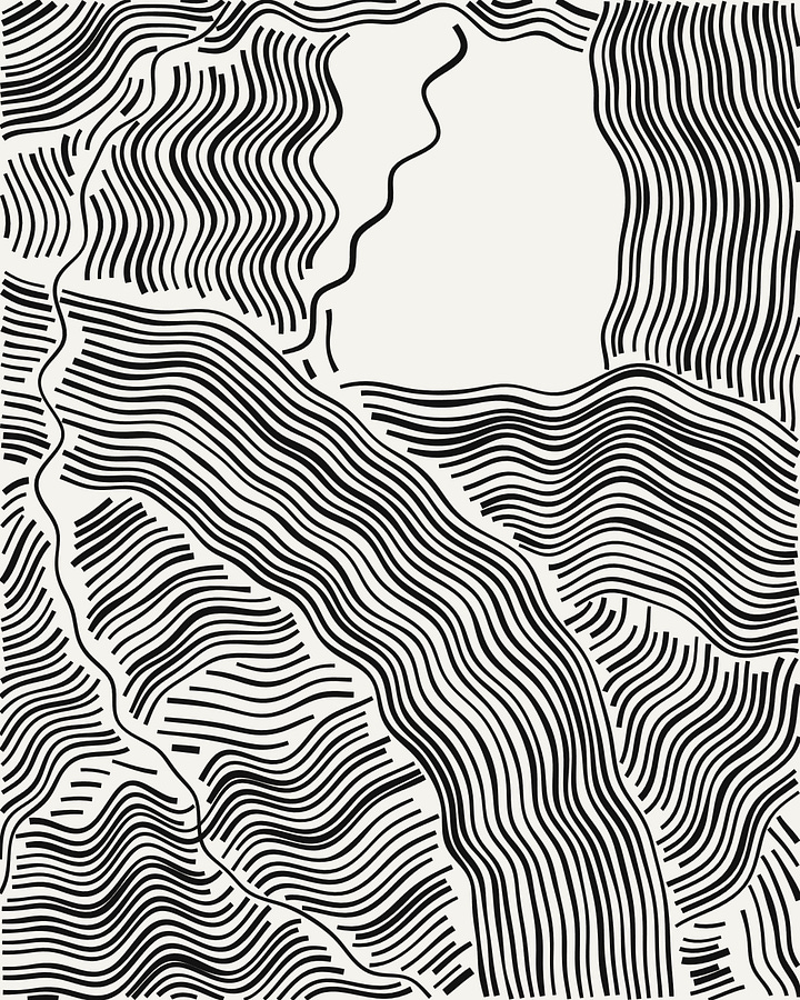
I was asked to participate in an exhibition about culture. And it might’ve been the astronomer in me, but my mind wandered over to thinking about “What defines human culture? As a whole?” Through a thought process that touched upon the Drake Equation, aliens, and more, I came to exoplanets. I wanted to use all the 5000+ exoplanets discovered so far for the final artwork, using inspiration from space (and the 90s for the design, the first being discovered in 1992).
I converted each exoplanet into a swirl, using its data to determine every visual aspect. They all move around the center, around Earth. Slowly moving, it guides your eyes to the center while you can think about that initial question “What defines human culture as a whole?”
See the Animated Version!
Milky Way Census | Scientific American
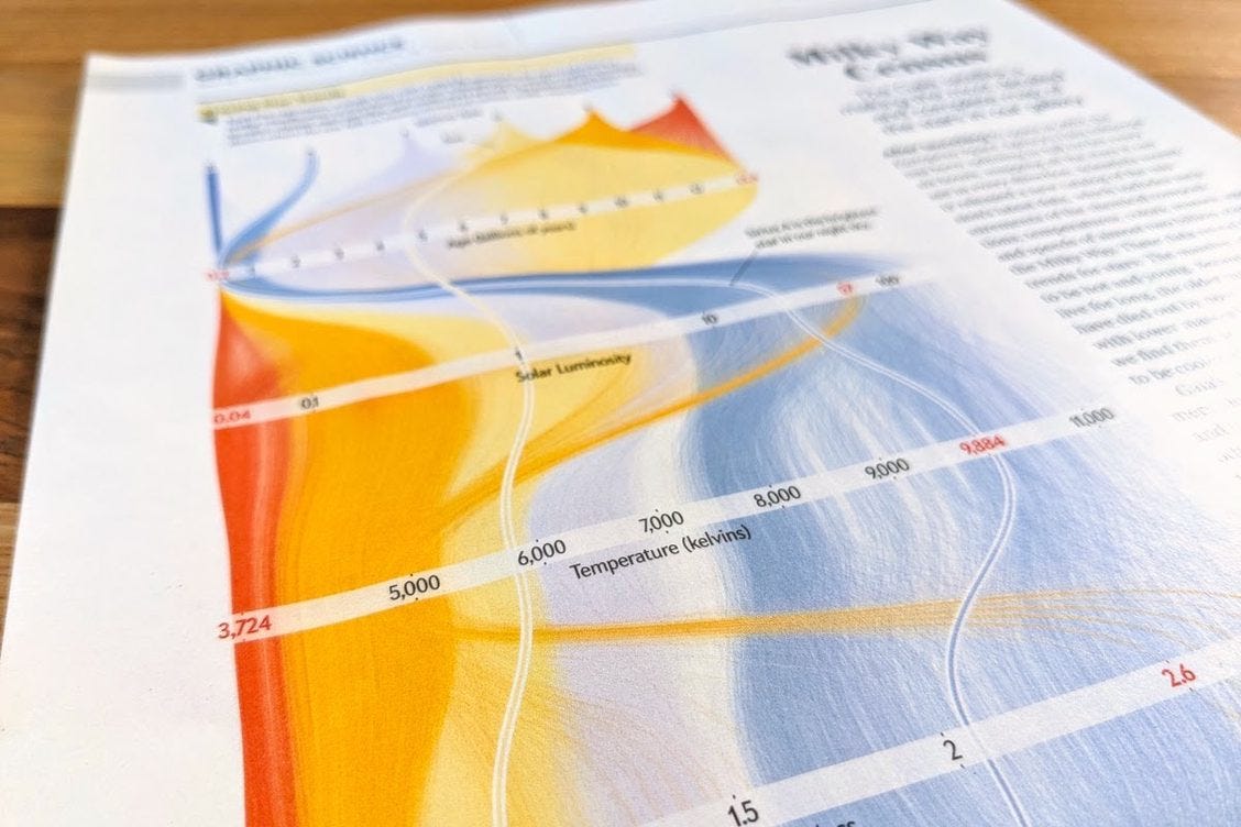
I’m glad how often clients reach out for astronomy projects (honestly, there can never be enough astronomy data visualizations for me!). For this piece about the new data release of the Gaia project (which has mapped over a billion objects to date!) I created a visual about ±85,000 of the stars nearest to us and how they differ in their size, luminosity, age, and more.
See more Close-ups of the Visual


Shop | Data Visualization Art Prints
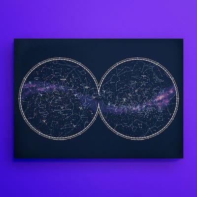
Just a reminder that you can find data visualization (and astronomy) prints of several of my projects in my online shop. From spirographs, Hubble, sky maps, visualizing pi, and more. The posters are printed on thick, textured archival paper with vibrant inks and utter crisp resolution that look great when framed.
(PS: there’s also a page that shows the signed prints available ʕ•ᴥ•ʔ )
Explore the Shop


Sneak Peeks
I’m currently working on three new collections! All generative art this time, one about space even! I’m at the start of all three of them, but really excited about where I’ll be taking them. If you’d like to follow their evolution, follow me on Twitter (or Instagram), where I’ll try to share lots of work-in-progress shots.


