

A Giant Map (+ giveaway!), Connections between Researchers & Visualizing Nintendo Games
Sharing my latest personal & client projects, art collections, blogs, and more

I decided to host a giveaway on LinkedIn of the new giant (as in wall-covering) map I made, which I wanted to share with you here as well. But there’s also a new interactive project visualizing how researchers work together, and a Blender dataviz about Nintendo Switch Games, and review of CHART.
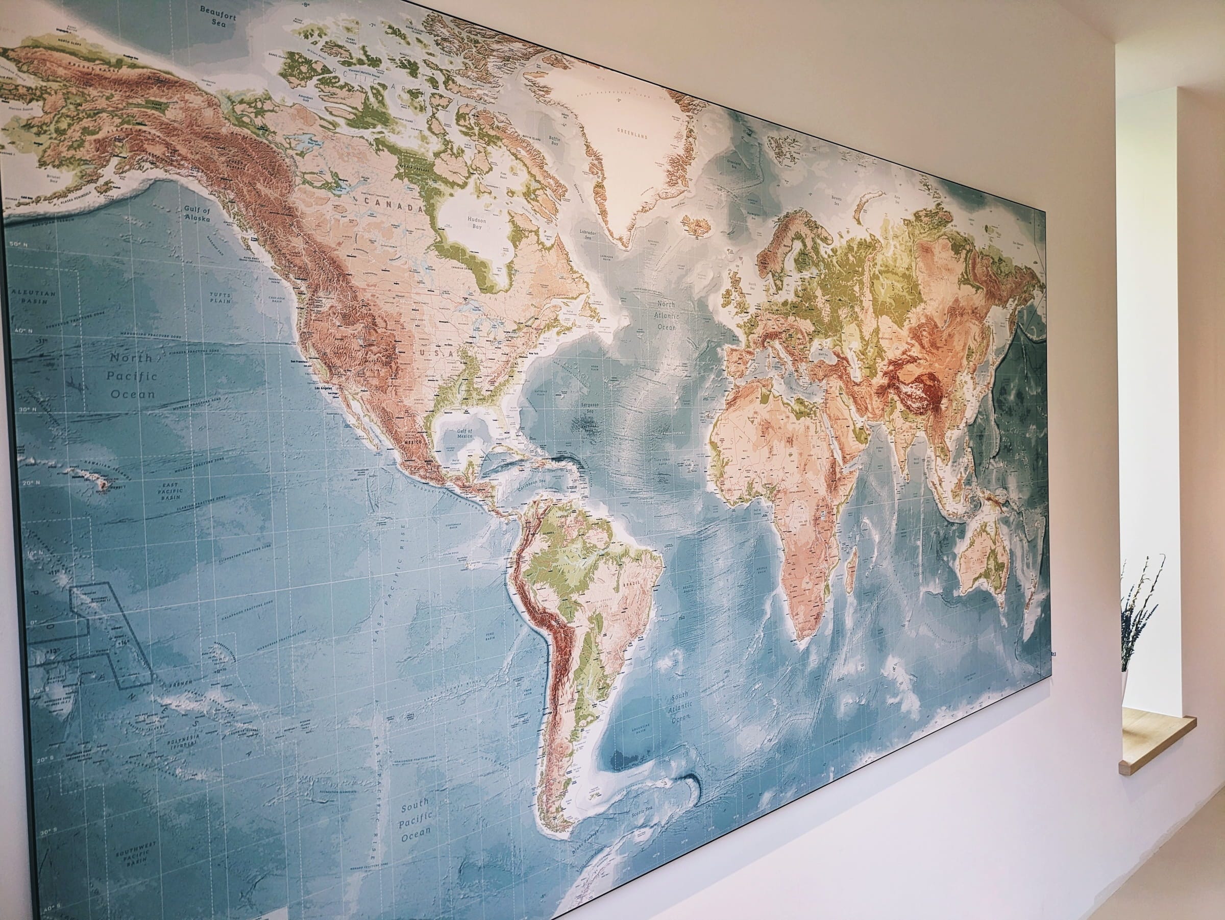
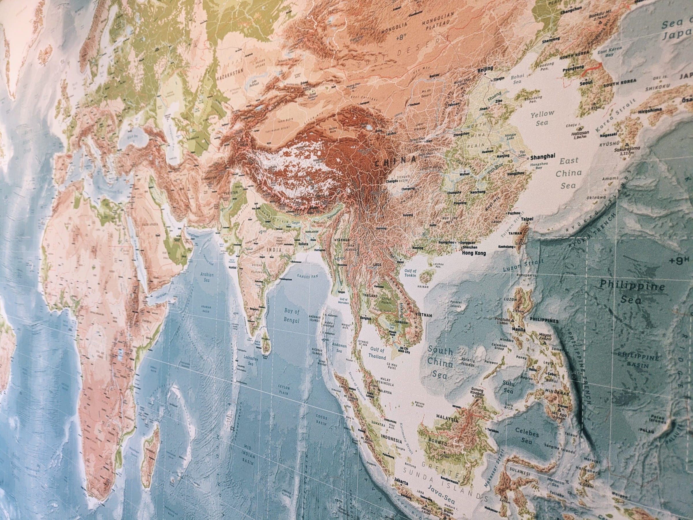
My Own Giant World Map
I spend nearly a year on this personal project to create a giant map of the world to dominate a wall in my living room (it’s 2.85m x 1.5m / nearly 9.5’ x 5’).
For nearly a decade I had the large IKEA world map in my living room. I loved standing right in front of it and wondering what places I might want to visit one day. After I moved, there was a large blank wall in the new living room, and there were always some things that I wanted to see different (aesthetically) from the IKEA map. And so, during many evenings, scattered in several bursts across the past year, I started working on my own version of a world map, an even bigger one. Adding more details (such as the terrain of the oceans), more labels, more details, more color! (It's based on open-source datasets such as Natural Earth).
I loved finally being able to decide exactly what I wanted to see on a map (hello volcanos, more mountains, glaciers, etc.). What colors I would enjoy most (also determined by the green and brown colors in the rest of the interior). Although it did take me a really long time to figure out what level of details was enough (and at what point the files got too big too load...). And label placement, oof... 😵 But I'm glad that is all behind me and I can now enjoy looking at this map in my room whenever I want.
(I’m aware that the Miller projection I’m using is far from perfect, but I had one constraint: I wanted the map to fill a rectangle)
You can read more about its creation process (and see more photos) on the portfolio page:
Check out more of the Map Here
Giveaway time!
I'm giving away a version of my world map! I have another. Sort of. The version hanging in my house is v2. Version 1 is nearly perfect too, but due to a miscommunication the sides were wrapped a little too far into the aluminium frame, so a small part of the map gets lost in the fold (a tiny sliver of New Zealand's North Island, and some of the degree markings along the edges). Nothing that ruins the experience (you're still getting well over 95% of the map). However, it meant I was allowed to order a new one, which I did, with a couple of small tweaks (notably, I changed from a map that runs from exactly from -180 (left) to 180 (right), to one where the cutoff is more along the split between Russia and Alaska). The photos below shows v1 of the map:


So now the v1 map one is looking for a new home!
One thing to know upfront: it does NOT come with a frame. If you want to hang it as a print like in the photos above, you'd need to order an aluminium frame separately, which costs about €426 through Art Heroes (you can contact their customer service to order just the frame). Not cheap, I know! But it's also a very large, high-quality textile canvas and frame. However, there are plenty of other things you could do with it beyond hanging it on a wall. The giveaway isn't only for those that would want to hang it on a wall (although if you do, that's fine too, I'd then love to hear where you're going to place it. In your home, the office, public library, …?). You might also turn the textile canvas into something wearable? Get creative :)
✉️ To enter: send me an email at info@visualcinnamon.com and tell me what you'd do with it. I'll pick the idea that speaks to me most. No strict criteria, just whatever makes me smile or think "yes, that's the right home for this map."
Due to shipping (and my luck with postal services) this is open to a shipping address in the EU only, sorry!
Deadline to reply: The end of this weekend, June 7th 2026
Visualizing Climate Action Research | TAC

I was approached by the Transforming Climate Action program, a team of researchers from four Canadian universities (Dalhousie University, Université du Québec à Rimouski, Université Laval, and Memorial University) working together to support just and equitable climate adaption, advance responsible marine carbon dioxide removal science and reduce critical uncertainty in the climate system.
The team overseeing the massive project was looking for a visual way to show how the researchers were connected through collaborations across various projects, specifically when they were from very different scientific disciplines.
The resulting highly interactive network is an inviting and playful way to encourage exploration and discovery of the people, projects and impacts within the program. You can hover and click on nodes to discover details, filter by discipline or project, and more.
Explore the Network Here
(or read more about the project on my portfolio page)
The Best-Selling Nintendo Switch Games
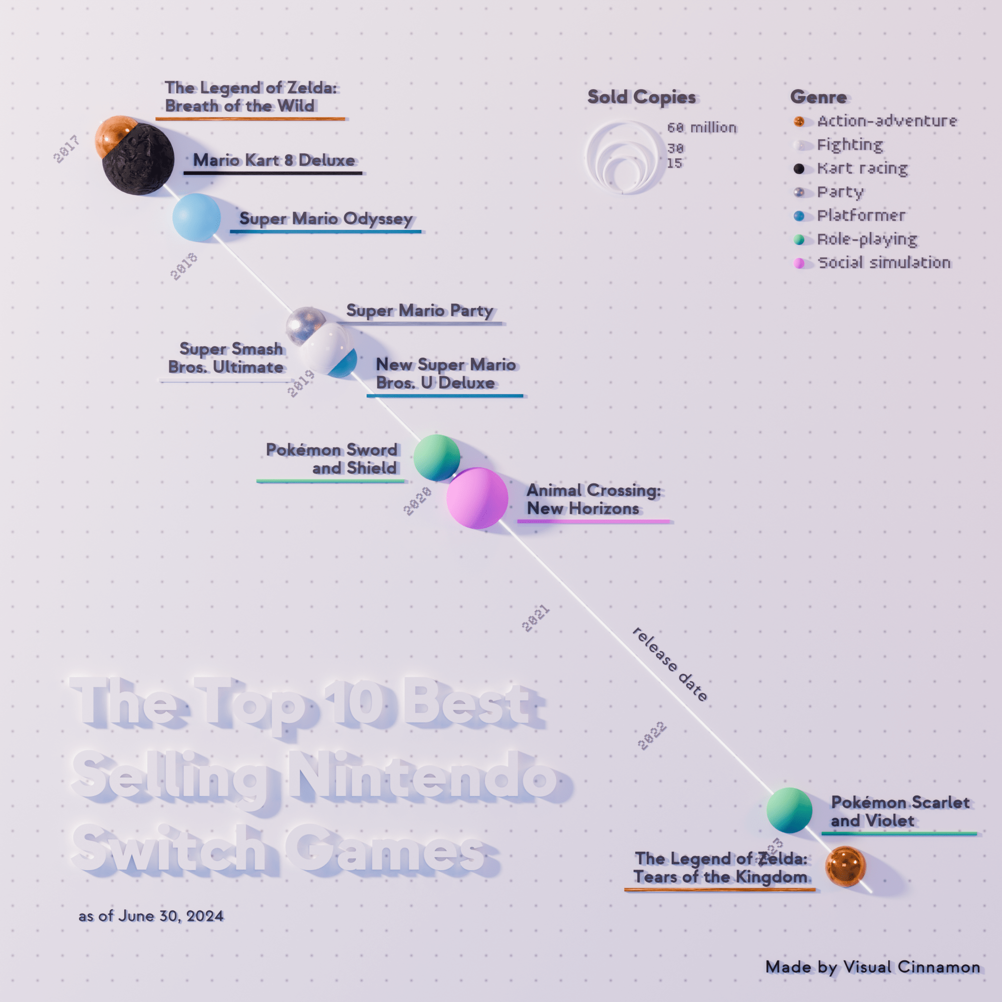
I worked on this small personal project in 2024, but I never got around to sharing it until now. It shows the top 10 best-selling Nintendo Switch games, as of June 2024. When they were released (position on the diagonal line), their genre (“color”) and the number of sold copies (size).
You might notice that it looks different in style than my normal visuals, it’s 3D! That’s because it was created with Blender (instead of d3.js, what I normally work with). I made this specifically for my (then upcoming) book CHART about creative data visualization, showing how you can look outside of the “standard” tools and software and be inspired by other fields to create interesting and unique visualizations of data.
I haven’t gotten around to making another visual in Blender since sadly, but I do keep it in the back of my mind for any new project I work on as a potential option.
See More Close-Ups & Video Here
An in-depth review of CHART
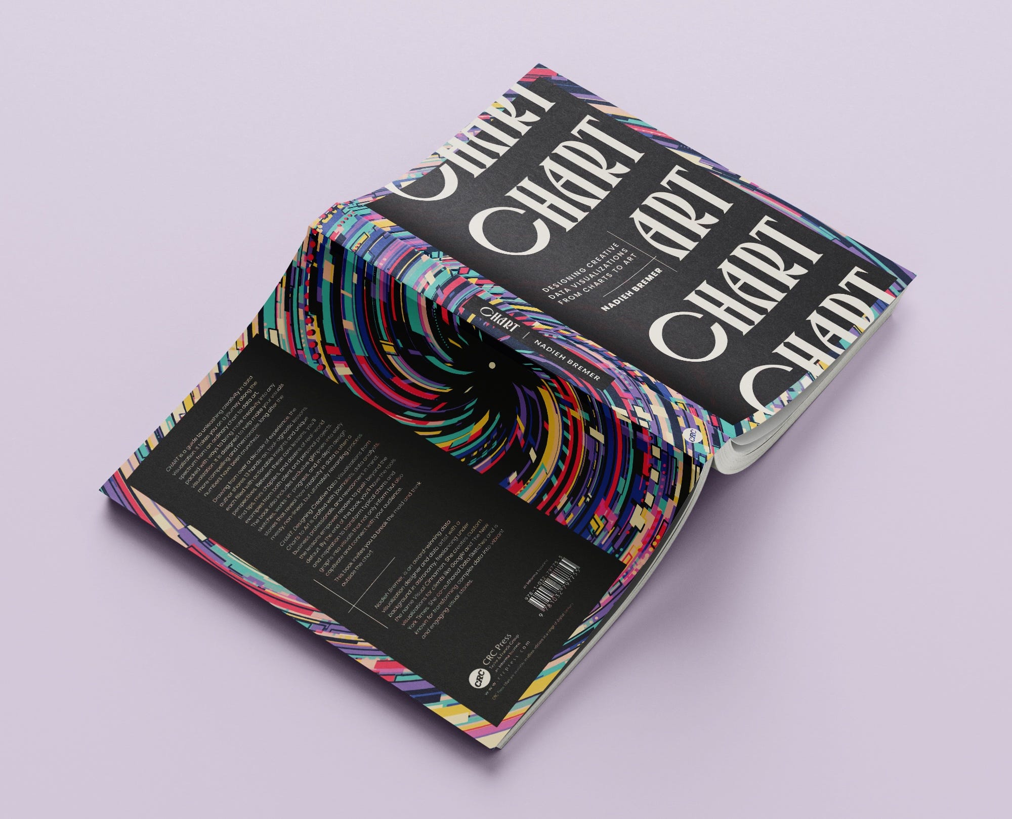
My latest book, CHART, got an in-depth review by Melissa Strong through the Open Visualization Academy. So in case you were still doubting if the book was a good match for you, I’d highly recommend reading her thoughts about it.
Read the Review Here
That’s it again for now. If you happen to be going to the dataviz conference &MOVE next week in The Netherlands, see you there!
PS: I’ll be giving a keynote at the PyData conference in Amsterdam this September. And I’ve created a brand new presentation that dives into the entire behind-the-scenes of my recent Searching for Birds project (showing Google Docs filled with chart screenshots, notebooks with sketches and some d3.js live coding) that I’ll be giving at another dataviz conference in the fall (but I’m not officially announced yet, so I can’t say more ;) )