

I wrote a second book! But also GitHub Networks, Exoplanets and Startups
Sharing my latest personal & client projects, art collections, blogs, and more

I can’t believe it’s been over a year since my previous newsletter! No surprise then that I’ve gathered a lot of new things to share. From an elaborate interactive network exploring GitHub repositories for Mozilla, to visualizing exoplanets for Scientific American, and more.
Oh right, before I forget, I’ve written a new book!!
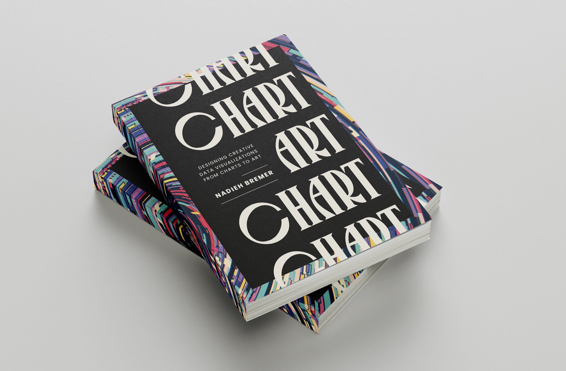
CHART | Designing Creative Data Visualizations from Charts to Art
If you’ve been seeing some of my posts come by on LinkedIn (where I’m somehow now “most active” of all my social channels) this won’t come as a surprise. But for those who haven’t, which I’m guessing is the majority of readers, I’m happy to announce that I’ve written a brand new book! As the subtitle alludes, it is all about how to add (a bit) more creativity to any type of data visualization. Whether that is a subtle touch to the more straightforward (business) charts or when creating data art, and every type of data visualization in between.
Thanks to the luminary insight from a good friend, it’s simply called CHART, because I honestly never realized that the word “art” is hidden within it until she pointed it out to me a few months ago while I talked about my struggles to find a name for the book.
The book consists of thirteen lessons and six mini chapters that go through my personal learnings and favorite techniques. I’m using examples from my personal and client projects from across the past decade to highlight the approach of each lesson.
As this book is all about creativity and making your charts look unique, memorable and beautiful, I simply had to hire Julie Brunet (creative editor of Nightingale’s printed edition) to turn the design of this book into something you’d want to put on display, and gosh, did she deliver!


I handed in the PDF-ready files last week and the book should be coming out at the end of May, so only two months away!
Check out the Book on the Publisher’s website
It’ll be a hardcover by default btw ✨
If you can’t wait, you can already read the foreword that (the series co-editor) Alberto Cairo wrote in his newsletter.
Visualizing GitHub Repositories | Mozilla

I worked together with Mozilla Builders to create a highly interactive network visualization revealing the top contributors to any repository and the other projects they’ve worked on, highlighting synergies across repos.
This visual shows how contributors deeply involved in one repository (e.g., PDF.js) often play key roles in other important projects. By awarding ORCA benefits (see next paragraph) to these impactful contributors, the hope is to create a ripple effect. Giving them the time to improve even more open-source projects.
For this project, I collaborated with Adam Bouhenguel, the creator of ORCA (Open Retrospective Compensation Agreement). ORCA enables businesses to share a portion of their revenue with contributors of the open-source projects they rely on.
Play with the Visual
The Amsterdam Startup Landscape | Cæmpus

I got to dive into the 300+ startups that ACE and three Amsterdam Universities have coached over the past decade; what technology, how many employees, any funding, are they still around today? I got to present these findings (as the above slide) during the soft-relaunch/rebrand of ACE to Cæmpus last summer.
See More of the Visual
The Exoplanet Radius Gap | Scientific American
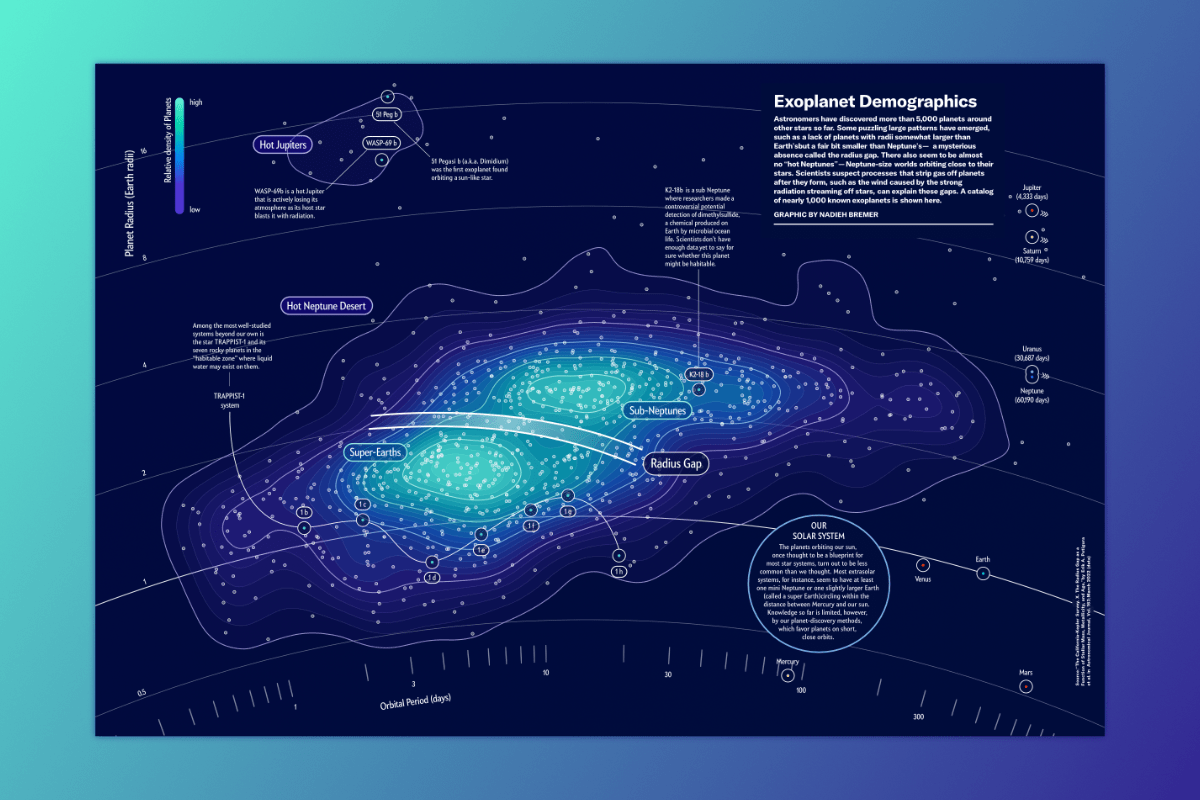
I’m always thrilled when I get to work on science-related visuals, especially when it’s astronomy! So I was very excited when Scientific American reached out to ask me to make a two-page spread for their article on the puzzling lack of planets (outside of our solar system) in a certain size range; the “Radius Gap”
The final visual might look like a standard x-y scatterplot, but it’s actually a polar plot, but with such a very large radius and a small angular section. As the vertical “y-axis” (the radius in the polar plot) represented the radius of the exoplanets, I felt that giving the chart a slight circular curve would be a nice fit.
Read the Article on Scientific American
I actually have several more things to share (A 3D viz in Blender, a whole data art collection!). However, this newsletter is already too long as it is. Instead, I’ll try and release two more newsletters within the next few months with all my other updates, so I can also keep you a bit more up-to-date about anything exciting happening around the book’s release.
Yay, and excited dive in when it arrives, looks great.
It's so beautiful! 😭✨❤️❤️❤️